
In part one of this post, we broke down the decision-making process for running a data-driven organization in an attempt to understand how KPIs can be weaponized in the wrong hands. Once the fundamental forces of how data influences perception are understood, the next step is to understand how these forces can shape the decision-making process in your organization to act as friction-reducing agents that can propel your organization into next-level decision making speed.
Each of the industry-tested best practices (detailed below) for the metricification of your enterprise aren’t that hard to understand, but they do require discipline and a strong commitment to socialization to keep the forces of gamification and weaponization at bay.
#1: Present metrics in “metric families” overtime to prevent both gamification and weaponization
While Goodhart’s law can’t be broken, it can however be bent using the concept of “small multiples” popularized by Edward Tufte:
“At the heart of quantitative reasoning is a single question: Compared to what? Small multiple designs, multivariate and data bountiful, answer directly by visually enforcing comparisons of changes, of the differences among objects, of the scope of alternatives. For a wide range of problems in data presentation, small multiples are the best design solution.” – Edward Tufte, Envisioning Information
In layman’s terms, this means that any KPI can only be judged relative to other contextual factors. For example:
Defect mean time to resolve (MTTR), a close cousin of incident MTTR which is the holy grail of all operational metrics, can only be judged within the context of the development ecosystem where it is tracked. Without knowing the number and age of defects in the backlog, how many new defects were introduced in a given time period, and how many defects were resolved in the same time period it’s not possible to judge the health of a development practice. To see how this would work in practice, refer to the sample chart below which is a rolling 24 months of defect management for a development team where inbound, outbound, backlog count, average age, and weighted MTTR are all represented:
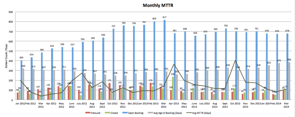
If we zoom in to any given month where there is a spike in MTTR, we can envision a conversation between two individuals and show how “metric weaponization” is mitigated.
At first glance, someone will see a spike and ask a reasonable question as pictured below:
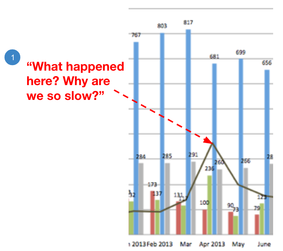
This question, whether it’s asked in inquiry or challenge, can easily be responded to by pointing back to the wider context:
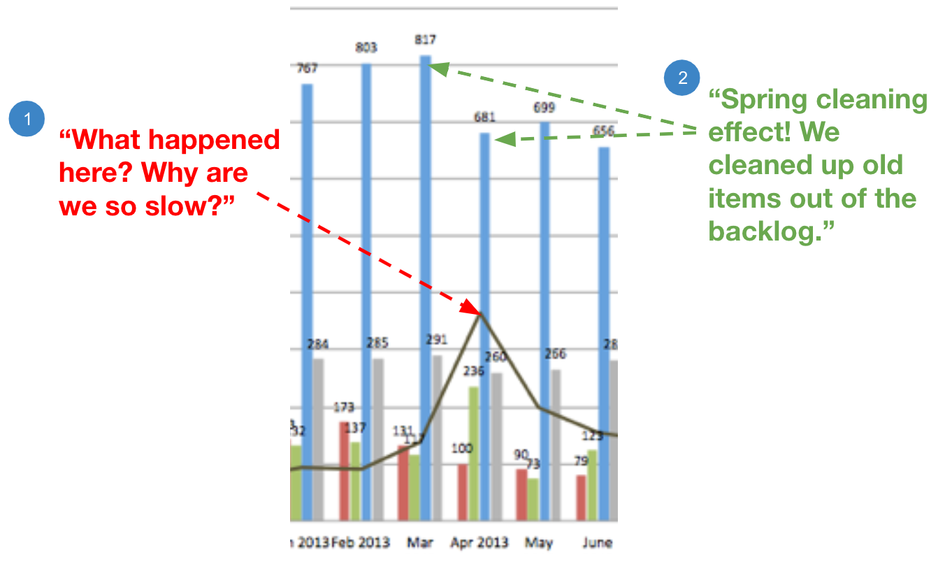
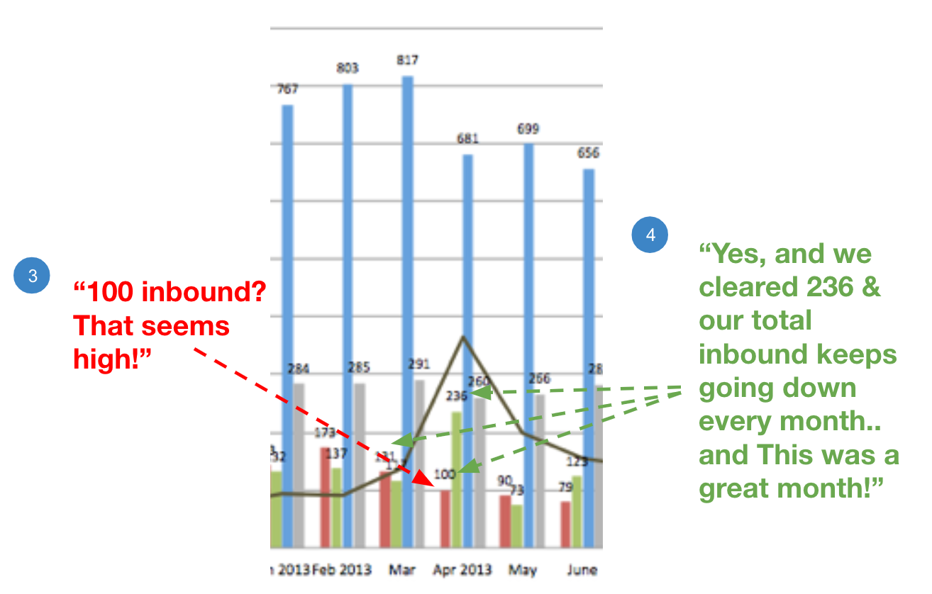
Even if the questioning continues, the wider context can almost always bring the conversation back to a constructive dialog by focusing on the systems-thinking lens:
When attempting to derive the right set of “small multiple” metrics to include in your metric family there are a few guideposts to follow:
- Remember that your metric family is an attempt to compress the “orient” phase of the OODA loop.
- Any family that includes more than seven metrics will be unintelligible to people trying to make a decision. Try to stick to five or less.
- Look to include a “lever” metric that represents an environmental factor that will both move other metrics “in the right direction” and can be directly driven by a focused commitment (e.g., in the defect MTTR example above, an “automated test coverage” metric could be introduced).
For another detailed example of a set of related metrics, please read our reusable catalog of reuse metrics.
#2: Use weightings to help contextualize the meaning of a KPI
In the previous example on defect MTTR, the MTTR metric is “weighted.” Using weightings can allow for compression of the “orient” and “decide” cycles by synthesizing the relative importance (the weight) of a KPI or parts of the KPI’s component inputs into the final metric output.
In the MTTR example above, defect MTTR is weighted by urgency where every individual defect tracked records both urgency and severity. While severity counts, it’s not the same thing as urgency (e.g., a full system outage is severe, but if it’s the cafe payment system, it’s not as urgent as your order entry system). In this example, the weighting can be computed in three steps:
- Group and average incidents by urgency.
- Weight the group averages based on urgency (e.g., by an incremental factor of 10) AND the number of incidents in each urgency category.
- Sum the averages together and divide by the total number of incidents.
With this weighted KPI, we now have a more refined metric because it reflects the performance of the organization to respond to “prioritized issues appropriately” rather than “plain old issues.” Aside from being a more meaningful metric, the weighted metric also acts as a disincentive to gamify the numbers by focusing on “easy issues” regardless of priority.
A key point in this example is to resist the temptation to fully segregate issues by priority in your reporting because once leadership starts to look exclusively on “high-priority” issues, they’ve effectively weaponized the data given that “lower priority” issues (e.g., “organizational debt”) often impact the speed of isolation and remediation.
#3: Always remember that the purpose of a KPI is to aid a person/team in the act of making a decision
KPIs do not have value in and of themselves. Much like “technology for technology’s sake” is a bad idea, measurement for the sake of measurement is also a bad idea. Once you and your team understand that KPIs are “decision making tools,” a basic set of questions can be asked that will often accelerate your ability to compose a KPI formula:
- Who’s trying to make a decision with this number?
- What level of precision do they need to make a decision?
These two questions can act as accelerators in the formulation of KPIs because they can help your team not only get into the headspace of your audience but also they can relieve the team of obsessive precision in favor of directional accuracy (given that a large set of decisions only need directional accuracy to make a decision).
#4: When making formula choices on how to compute a KPI, ALWAYS choose the option that “makes you look worse than you actually are”
One truth about KPIs to embrace is that “the map is not the territory” (illustrated in the art world most notably by surrealist painter René Magritte in the painting “This Is Not a Pipe” pictured here).

This concept in the context of KPIs informs the process of formulation and decision making. Given that the KPIs are a model of reality, but not reality themselves (e.g., there will always be imperfections in the data and the KPI formulas), teams will make decisions that skew the numbers in one direction or another if they want to progress on tracking and managing based on KPIs.
It is critical to inform your teams of the general principle to always choose the option that “makes you look worse than you actually are” in order to preserve transparency and trust.
Given that management and leadership will at some point perform “pressure tests” on the precision of a measurement, intentionally skewing towards “looking worse than you are” is the only rational choice. Noting that skew is unavoidable and that there will eventually be skew conversations, skewing to “look worse than you are” is easier to explain and leaves your reputation intact while skewing towards “looking better than you are” invites questions of integrity and motive.
#5: Plan for aggregation and segregation by value stream and cause (at least)
The above best practices all point to the idea that KPIs are tools that are intended to aid understanding, constructive discussions and decision making. It is also important to understand that these discussions happen in an enterprise context where attention and effort can not and should not be equally applied. KPI dashboards can be thought of as “heat maps” to find areas of strength and weakness. Leaders and individual contributors (ICs) will want to know both areas of strength and weakness because:
- Areas of strength allow an organization to identify sources of positive progress that can be leveraged across an enterprise.
- Areas of weakness allow an organization to identify where they want to channel not only the information and knowledge from the areas of strength but also the support and time necessary to integrate the approaches and tools that create positive progress.
Similarly, an organization will want to show these KPIs at multiple levels of aggregation (e.g., team, value stream, application, department, LOB, etc) in order to allow:
- Localized teams to be self-accountable.
- Leadership to understand macro trends (i.e., have sufficient information to captain the ship).
- All parties to understand micro trends (i.e., areas of strength and weakness).
- Create the space local optimization at the expense of the whole can be mitigated.
#6: Use KPI dashboards to teach decision making and systems thinking
All of the above best practices support the goal of helping people, regardless of level or discipline, to develop an understanding of KPIs and their relationships to each other. This understanding helps to establish:
- A systems view of platforms and the organization
- Inter/intra organizational trust
- Momentum and appreciation for progress
- A sense of urgency when needed with a grounded prioritization method
- A data-based decision framework
When teams and leaders have ready access to ecosystem metrics (development factory metrics, technical/operational performance metrics, business value metrics, etc), conversations move away from anecdotal feeling and towards constructive dialogue.
One specific capability that comes from being able to apply the systems-thinking lens is that both business and technical teams will be able to “code switch” in their language and concepts.
- Business and product leads will then “read right to left” and understand how factory/technical KPIs add up to and drive business KPIs.
- Development, architecture, and operational staff will “read left to right” and understand how business outcomes are driven (or sometimes gated) by technical/factory shortcomings.
This “code-switching” capability will allow for different disciplines to begin to talk with each other rather than past each other on the real topic of business outcomes represented within KPIs.
#7: Piggyback on existing frames of reference to speed up “orientation” and “decide”
All dashboards, and the metrics within them, will ultimately create “affordances” to speed up orientation and decision making or “dissonance” which will inhibit those phases of the OODA loop. One technique you can use to create affordance and reduce dissonance is to piggyback on metaphors and frames of reference that are common to the audiences of your dashboards.
This particular concept is demonstrated above in practices #1 and #2 where the example uses “Defect MTTR” which is an extension of an industry wide standard “Incident MTTR.” When you extend the existing frame of reference it allows newer dashboard users to orient themselves to the new frame of reference without significant effort. Once you’ve extended a frame of reference, you can repeat that extension in other domains as well. For example, you can perfect a template for one flavor of MTTR (e.g, incidents) and then develop other flavors (e.g., defects, performance issues, security issues, etc.)
#8: Understand that manual KPI reporting is sometimes worse than “flying blind”
Almost everyone would readily agree that “Flying Blind” (i.e., operating on guesswork and intuition) is not a good way to run a business or software development capability. Where this idea breaks down is when “manual reporting of KPIs” becomes the dominant method of data capture for decision-making tools. Automated metrics collection is an essential component of a DevOps strategy as it is directly referenced in the standard CALMS (culture, automation, lean, measurement, sharing) pillars of DevOps.
Manual reporting at scale has several serious consequences that need to monitored:
- Manual reporting bleeds an organization of operational expense (OPEX) funds which could otherwise be used to retire debt that keeps an organization from accelerating the SDLC.
- Manual reporting lengthens the time spent in the “observe” and “orient” segments of OODA loop and acts as a drag on an organization’s agility, often when it needs it most.
Automated KPI collection, management, and tracking is a necessary component of agility. When business partners and leaders say they want to advance an organization’s agility and speed, they must commit to automated KPI collection in the same way that they must commit to automated deployment pipelines. Keep in mind that this best practice doesn’t mean that all manual report creation is bad, it only means that consistently relying on it as input into time sensitive feedback loops is bad.
#9: Treat “measurement” as non-deferrable scope
While many enterprises don’t have a well understood and repeatable culture of “non-deferrable scope,” it is unlikely that the concept doesn’t actually exist in practice. For example, product owners usually aren’t authorized to launch new public-facing applications that haven’t been subject to a security audit of some type. Security work is a clear example of scope that business partners do not have the authority to defer without meaningful conversations with security and risk professionals.
Having a set of architectural rules beyond security that call out topics that fall within the boundaries of “non-deferrable” scope serves to avoid “disruptive fire-drills” and “unplanned for balloon payments.” In practice, what this means is that sprint teams must include some level of measurement scope in their sprint plans where “some level” is defined as “more than nothing” (e.g., identify the formulas for metrics to track, instrument the metrics identified in the previous sprint, design the dashboard to visualize the tracked metrics, identify alerting thresholds and rules, etc). Apply “non-deferrable” in a measured/balanced fashion where teams understand it’s not about measuring everything, it’s about chipping away and having a practice of continuous improvement.
#10: Use critical thinking when applying thresholds to KPIs for alerting
Every KPI you measure will at one point or another beg the question of “Do we want to be alert on that KPI?” This particular question has so many contextual dependencies that it’s not fit to cover here. What is more important to talk about is how to think about the types of thresholds that make sense once you’ve identified whether a metric should be alerted on and answered the questions on “who needs to know?” and “who wants to know?”
Three types of basic thresholds are simple to conceptualize and apply; % deviation, hard ceiling and hard floor.
- Percentage deviation: This type of threshold tracks whether a KPI deviates from the previous KPI by a large percentage (where “large” is a relative term that can be defined by the team “needing to know” about the deviation). Percentage deviation thresholds are useful in detecting large deviations that might represent very good or very bad outcomes. When applying percentage deviation thresholds for alerting, make sure to consider whether you want to only alert if the spike sustains for a period of time to not swamp a person with random anomalies that don’t require attention.
- Hard ceiling: The downfall of percentage deviation is that you open yourself up to “death by 1000 cuts” where numbers creep in the wrong direction little by little over time and never move in a swing large enough to trigger the percentage deviation threshold. Putting in a hard ceiling corrects for this and establishes a number where someone must pay attention regardless of the trend. For example, in web performance land, two seconds is widely regarded as a benchmark that could be used as a hard ceiling if you track “real user metrics” on page performance.
- Hard floor: Quite often teams will put upper bound thresholds for alerting and not consider lower bound thresholds for “problem areas” with the idea that “lower numbers are always good” like a stroke count in golf. The problem in this model is that sometimes numbers drop significantly due to unforeseen circumstances like instrumentation being broken or necessary steps being skipped based on factors that were not fully considered at the time of development. Putting in a hard floor corrects for these scenarios and establishes a lower bound number where someone must pay attention regardless of the “good news” (e.g., a response time of zero isn’t necessarily a good performance number and usually requires deeper analysis to understand what is happening).
#11: Barometers beat toll-gates and litmus tests
Once your organisation starts using metrics at scale, there will be a tendency to use KPIs to reduce complex topics to binary “yes/no” decisions. Using singular KPIs to act as litmus tests or toll-gates in software development contexts to drive programmatic decisions that impact large contexts is almost always a bad idea.
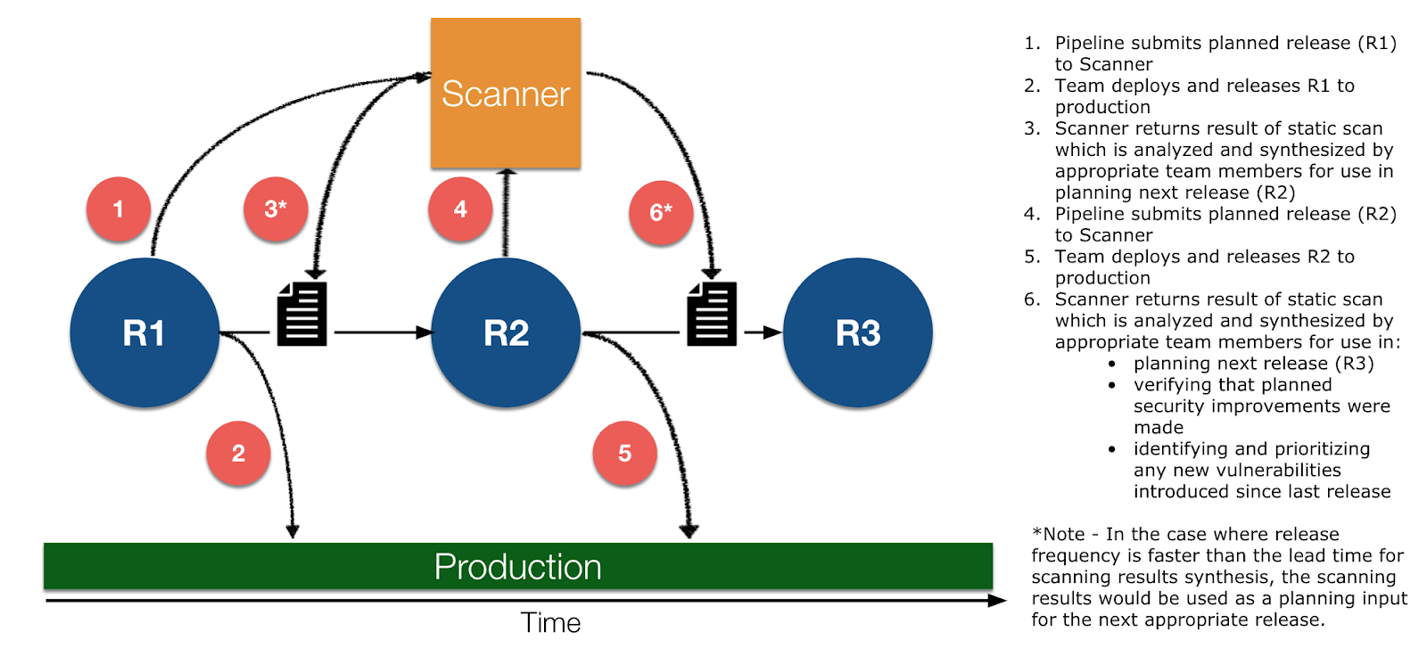
A better idea is to use KPIs as barometers rather than toll-gates because many health indicators are better viewed in the trend context than the snap-shot context because “toll-gate” models create backlogs and impede flow. The KPI-as-barometer concept can be easily understood in a security context. For example, let’s say you have an automated pipeline that sends build packages to an external scanning system for security analysis. A localized (toll-gate) view might say “halt the release if the scan comes back with any substantial security defect” but this model is too flat and simplistic in actual SDLC factory contexts because it neglects two key factors:
- Security scanning is not real time and often takes weeks to fully understand and integrate any recommendations. As DevOps has shown, flow is king in SDLC factory contexts. Inserting a multi-week lag time for releases is not a good idea in most modern software development contexts that drive business critical initiatives.
- Halting a release based on localized metrics fails to account for the trend in those metrics (i.e., Is it a good idea to halt a release that has five security defects when the release currently in production has seven security defects?).
Refer to the diagram below to understand how a barometer approach can be used to take the outputs of an activity (in this example a security scan) to inform future releases rather than to halt a current release.
Applying the practices
One factor woven throughout all of these best practices is the idea of continuous improvement applied incrementally over time to build a practice of data-driven decision making. In order to be successful with pivoting into a metrics-driven organization, this is critically important because it’s not realistic to use each of these practices and ideas on day one. Just like an oak tree takes 20 years to be the beautiful expression of nature, a data-driven ecosystem needs water (effort) and sunlight (socialized visualizations) to be impactful in your enterprise.
One specific difference between the organic growth of the oak tree and your KPI ecosystem is that you can accelerate the growth of your API ecosystem through the use of MuleSoft’s free, open source, metric framework that supports our proven Outcomes-Based Delivery model that has been tested with thousands of successful customers worldwide. If you would like to learn more or get help on standing up a practice of KPI management in your organization please reach out to your MuleSoft customer success manager and tell them you are ready to begin your KPI journey.


