“I believe that if we think first about people and then try, try, and try again to prototype our designs, we stand a good chance of creating innovative solutions that people will value and enjoy.” – Bill Moggridge, Designing Interactions
Prototyping is a key practice of design; it allows designers to visualize, evaluate, and communicate.
To explore design ideas, the prototype must be quick and inexpensive. It must suggest and explore these ideas, rather than confirm them. That’s why some HCI researchers like Bill Buxton, prefer the term sketch over prototype.
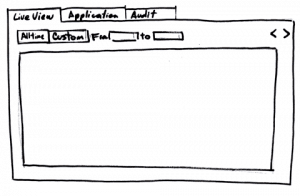
Paper prototypes have a unique feature: the return of investment, in terms of learning, is extremely high. It takes hours or even minutes to be created, and in exchange you can receive valuable feedback.
If you prefer digital means, tools like Balsamiq or Pencil, imitate the sketchy nature of a paper prototype. The term low-fi prototypes is used to refer to this kind of prototypes, regardless of them being on paper or not.
Tip: to quickly clean up scanned sketches, use the adjust levels option, included in most of the photo editing applications.
As design matures, more details are needed and low-fi prototypes cease to be enough. The good news is that you don’t need to create a prototype of the whole application, but to explore only the areas that needs more details. For example, a team from Autodesk, in one of the first articles about combining Agile and user centered design, described how they used small prototypes to test parts of the interaction.
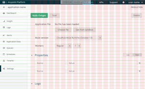
Interaction goes side by side with visuals, and at some point of product development visual details need to be nailed down. Here is where detailed prototypes, usually in the form of static Photoshop or Illustrator images, come into the process.
Lean Software Development uses the term waste for things that don’t add any value to the final product. For example, working in unnecessary features is waste. Handoff of information between teams can be a source of waste too.
In that sense, detailed mockups generate waste: once an Illustrator or Photoshop file is translated into the implementation, the prototype becomes obsolete.
Some people argue that having a detailed prototype, is the only way to create pixel perfect user interfaces.
But what does pixel perfect mean? On the web, your interface is going to be used in different browsers, where not only does screen sizes vary, but also rendering algorithms like anti-aliasing and color management.
For me, pixel perfect is rather a desire for attention to details. This means you don’t need to match your static image pixel by pixel. The same level of detail can be achieved directly in HTML.
Tools like Photoshop or Illustrator are still useful to quickly sketch colors, fonts, and layouts. But once you have the design idea changes in HTML/CSS are faster.
Coding could scare any graphic designer, but as a industrial designer has to master materials, a web designer has to deal with HTML. And this means dealing with code to some degree.
The more you master tools like HTML and CSS, the more you can experiment beyond the limits. Interactive designs, like the ones used in Google doodles or the parallax effect used by the Nike better world campaign of 2011 (the new site design doesn’t use parallax effect anymore), requires a mastering that cannot be achieved from static images.
When it comes to reducing waste, you can go a step further and make the designers work directly with the code. For me, that’s pushing a little bit too far.
The goals of the designer and the developer are different. While the designer wants to explore design options, the developer worries about things like modularity, maintainability, and performance. Try to re-arrange a design split into 10 different UI components, and you’ll see what I mean.
So, even if you don’t go that far, the waste generated by HTML prototypes is more sustainable since you can still recycle things like CSS or some parts of the HTML. The only advice that I can give you is addressed to UI devs: avoid early optimization; instead of first creating a generic UI component , wait a little bit until the application matures. That early optimization adds a lot of pain when it comes to updating the design.
Did you know? Facebook used Quartz Composer to prototype animations for their mobile apps. For web apps I still prefer CSS3 animations as a prototyping tool, but is always good to count with extra tools in the toolbox.
Hands on
To get started with HTML prototyping, you only need a text editor and some command line tools. There are a lot of WYSIWYG HTML editors out there, but in my experience, those editors are great when you are learning HTML; but once you get proficient, the UI gets in the middle: it makes it difficult to split your work into smaller chunks, or to automate repetitive tasks.
We are going to use NodeJS, and a scaffolding tool called Yeoman with a template called ui-prototype, to setup an environment for rapid HTML prototyping.
Once you install NodeJS you are able to install Yeoman and other required tools with the following command:
npm install -g yo generator-ui-prototype grunt-cli bower
Then create a directory and tell Yeoman (the yo command) to fill it with the ui-prototype template:
mkdir myproject
yo ui-prototype
What did you get here?
-
Gruntfile.js defines a series of tasks for a tool called Grunt. It will take care of serving a local development web site, and of processing some files.
-
src is the directory where all the magic happens. There you have a bunch of example .jade files, and example .less files.
– What is LESS and Jade?
– LESS is a CSS pre-processor; it allows writing CSS in a structured way.
– Jade is a template language that allows you to reuse parts of HTML and to write less code. -
bower_components contains JavaScript libraries managed by a tool called Bower. The Grunt script will take care of copying the JavaScript libraries to the .generated directory. The advantage of Bower is that you can easily install/upgrade/uninstall libraries with a command.
First run
In your project directory run:
grunt
- It will process the files in src, creating a hidden directory called .generated.
- Then it will start a web server using .generated as root.
- Each time you change something in src, the .generated directory is updated.
- You can put any kind of file in src, but the advantage is the automatic processing of .jade and .less files.
The development server started from Grunt, will use a library called LiveReload. It will automatically refresh the web page each time something changes.
How does this help me with prototyping?
Jade templates allow you to share a common structure for your pages, for example:
extends _layout
block content
  p hello
Uses _layout.jade as the page template, replacing the block content with the given value.
Tip: Jade is a huge time saver, but if you prefer plain HTML take a look to Emmet it’s available for a lots of editors.
The underscore at the beginning is a convention used by ui-prototype: each file that starts with _ is not processed as a standalone page. That’s ok since _layout.jade is a fragment to be included by other Jade files.
Jade also allows you to create macros, which are a huge time saver for prototyping, for example:
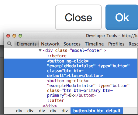
+btn("exampleModal=false") Close
It’s using a macro called btn, that produces the following HTML code:
The example LESS file src/styles/main.less, imports all the styles from Twitter Bootstrap. You can remove or customize it by defining some of the customization variables.
Also in main.less you’ll see some helper CSS classes to style using flex boxes. These allows you to quickly define layouts.
The index.jade example, puts all together. Plus, it uses AngularJS to show you how to mock interactions without writing a line of JavaScript. How? Here is a small example:
That was a pretty short and quick explanation! There are tons of topics that deserve a full article. Like AngularJS in the context of prototypes, or the use of flex boxes. In the spirit of learning by doing prototypes, I recommend you to go ahead and give it a try. Drop me any comments or questions. I’ll be glad to help.


