When you log in to Anypoint Platform, you’ll notice some changes have been made, providing a more clean, modern, and consistent experience throughout the platform. In addition to cleaning up the layouts, we have optimized the products so that navigating the various areas within a product is easier and more clear, and so that important information is prioritized.
In this latest release, the MuleSoft Product team has rolled out several enhancements to Anypoint Platform:
- More functional/informative home screen
- Consistent, modern navigation
- Visual redesign throughout the platform
The home screen – your launchpad
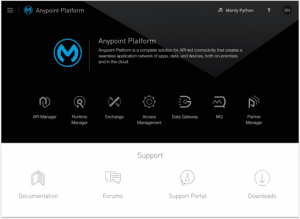
The first thing you’ll notice when you login is that we have simplified the Anypoint Platform home page, making it easier to dive into the application you want to get to work.
On the top section of the screen, you’ll see all of the applications displayed along with their product icon; hovering on each icon displays more information about that application, and clicking the icon takes you directly to the associated application.
We’ve also included some helpful links below to let you find the information or assistance you need to get productive.
New navigation menu – how to get around
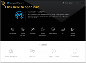
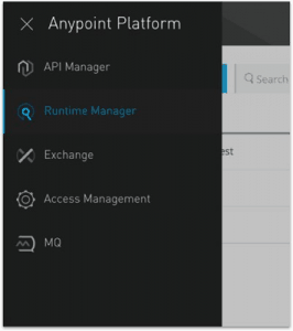
You will also notice that the product menu is no longer a collection of links listed horizontally on the top bar. You can still use the top bar to access your Business Group and profile information; however, all of the products are now available in a collapsible side menu.
You can open the product menu by clicking the ‘menu’ icon in the top-left corner or by pressing the ESC key to expand/collapse the panel.
Moving the products into this product menu allows us to scale as we add more functionality to the platform, and will provide a much better experience when the platform becomes optimized for mobile experiences.
Visual redesign
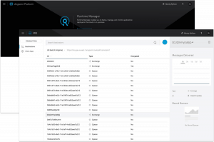
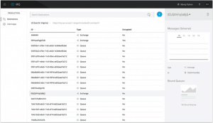
In addition to the notable changes above, all of the Anypoint applications have received a facelift to follow a common MuleSoft look and feel, which uses context and spacing to better organize information.
A cleaner, more streamlined detail pane provides high-level information and expanded object pages provide a more in-depth look at individual platform artifacts.
We want to hear your thoughts!
Tell us what you think of the changes we’re making to the Anypoint Platform. Comment below or contact us directly at ux@mulesoft.com to share your first impressions.
