Disneyland is a fantastic place to learn about UX (user experience) design. We would like to share 5 of the many UX lessons we learned on a recent visit.
Disneyland has long been regarded as the “happiest place on earth,” largely because of the carefully curated guest experience. Disneyland possesses an atmosphere of excitement and adventure and greets returning visitors with a wave of nostalgia. It has been upheld as a gold standard in customer service and has employed sophisticated design methods to help guests suspend belief and experience magic.
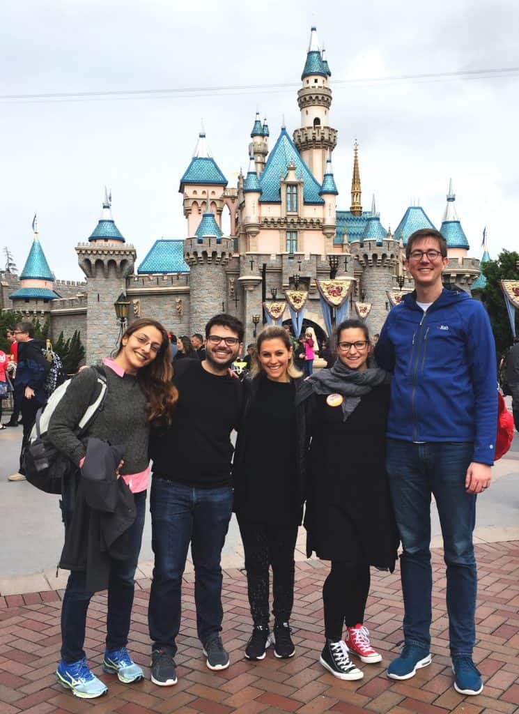
While recently visiting Disneyland, our team couldn’t help but notice the physical manifestations of many software design principles. MuleSoft’s UX team has the mandate to improve software experiences for our users. We strive to understand current user needs and goals, which we translate into product experiences with the help of our outstanding product and engineering teams. We’d like to share some of the UX highlights from our visit to the happiest place on earth.
Reciprocity
While not strictly a UX design principle, reciprocity is an important principle of behavioral psychology. Reciprocity was popularized by Robert Cialdini in his book “Influence: The Psychology of Persuasion”1 and states that humans are hardwired to return favors. Reciprocity is an important tool in many business relationships, particularly when you are attempting to motivate someone to act in your best interest. The UX implications are that if you can provide a tool that enables users to successfully accomplish their goals, they are more likely to promote and purchase more of your products in the future.
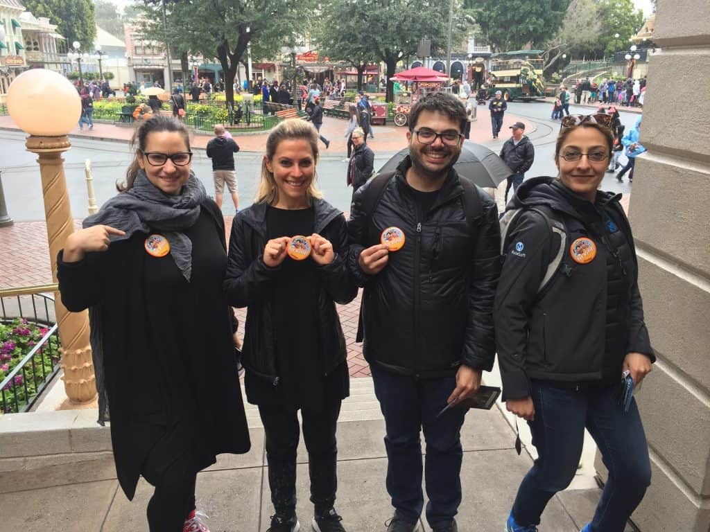
We witnessed reciprocity at work in a few instances. Upon arriving at Disneyland, if it is your first visit or you are celebrating a special event you can check in at Town Hall and receive a free button. Most of the UX team had never visited Disneyland before, and the small gesture recognizing their first visit immediately exceeded expectations.
We also experienced reciprocity in action while eating dinner at the Blue Bayou. The wait staff appeared to have a maniacal focus on ensuring our glasses were never less than 70% full. It was almost overwhelming how regularly the staff topped us off, which was a pleasant change from many dining experiences where you may wait a while with an empty glass. The quality of service and constant beverage attention established a small sense of indebtedness, which led to greater generosity when it came time to settle the bill.
Effectively managing wait times
Much of the time spent in any amusement park is spent standing in line for the attractions. Disneyland understands this and has spent a great deal of energy ensuring that time spent in line is as pleasant as possible. We noticed many enhancements to the queueing experience that have software implications:
- Occupy people’s attention – An occupied mind is less likely to experience stress or anxiety while waiting, both of which can make time appear to pass more slowly2
- Proactively manage expectations about the wait – By providing overestimated wait times you set expectations that will be exceeded by the experience3
- Remind users why the wait is worth it – Many of the queues provide a clear view of the attraction’s loading area as you enter and often weave back to remind you of the reward at the end of line
- Start slow and speed up – Lines are viewed more favorably when progress is made slowly at the beginning and speeds up over time.4 This tactic is applied to many of the very popular rides. On Space Mountain, you spend most of the time waiting in a slow line outside of the ride (30+ minutes). Eventually, you get released and can briskly walk through the building and wait briefly to enter the ride (<10 minutes)
- Ensure that the wait was worth it – People view unpleasant experiences (like waiting in line for over an hour) more favorably if the experience ends positively. If people enjoy the ride, they are less likely to have negative memories of the wait
Curate focus
Thorough design provides guidance on how to move through an experience. In software, this is done through logically organizing an experience and providing appropriate clues via description text, tooltips, or visual treatment. Disneyland does a fantastic job of curating experiences, which ensures consistent visitor outcomes and leads to memory creation that can evoke nostalgia.
Disneyland’s Main Street is a good example of that curated focus. It creates a complex optical illusion which is created through manipulating the architecture. The buildings are constructed so that they gradually get shorter as they approach Sleeping Beauty’s castle. This creates the illusion that the castle is much larger than reality. The orientation of the street also immediately connects people with the castle, which serves as a central landmark while navigating the park.
Directing a user’s focus can be achieved with movement, the position of elements, and visual emphasis. The guide in the Jungle Cruise uses precise timing to guide attention towards the next animal. The doom buggies in the haunted mansion physically turn the visitors to direct focus. In software, animation can serve the same purpose. The kinetic motion in interfaces can help us relate to the product in a more physical way, which deepens a user’s experience. Rides like Indiana Jones and Space Mountain excel in using light (and the absence of light) to direct focus to the appropriate spot at the right time. Embracing white space in digital interfaces can also emphasize elements and guide users to success.
Navigation and Consistency
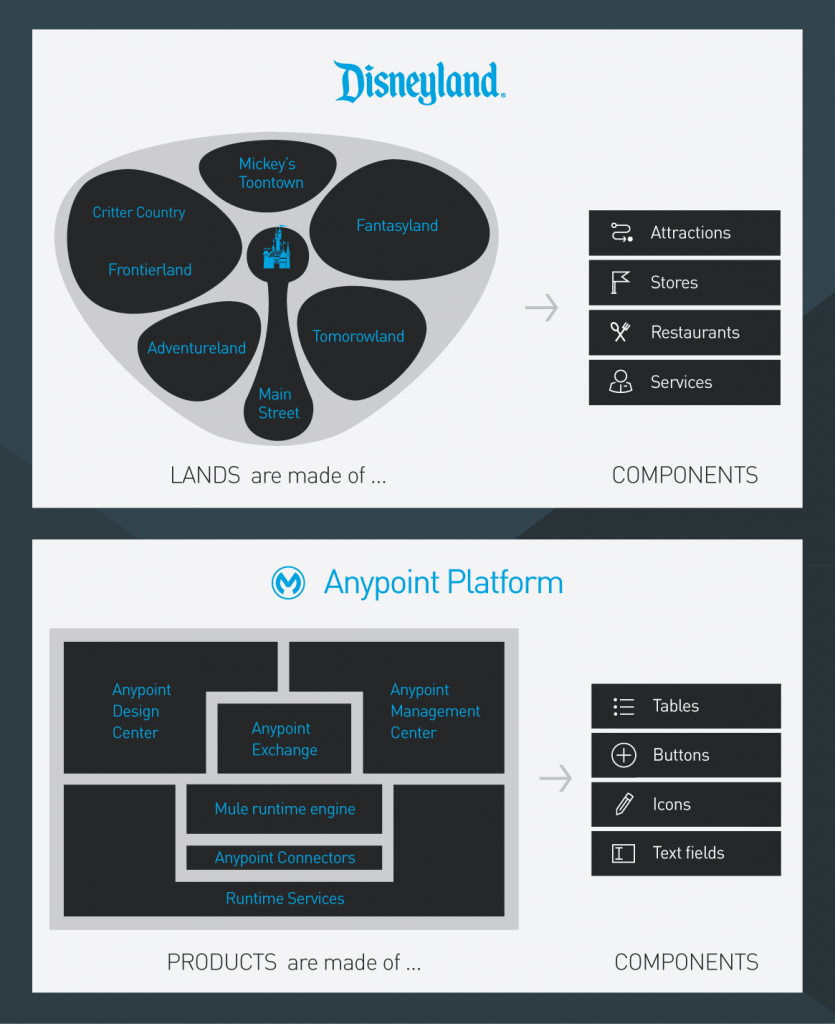
One of the most distinct experiences offered at Disneyland is the opportunity to be transported to a different continent or era. This is accomplished through extremely detailed environment design. Within a matter of minutes, it is possible to wander through a curiosity-filled bazaar, a land where fantasy is real, a cartoon town, and even a galaxy far, far away. Each district is distinct, and the style and materiality shift to delineate and reinforce the experience of being transported. While distinctly unique, each district is comprised of the same basic building blocks: A mix of attractions catering to different age ranges, gift shops, dining venues, and general decoration to reinforce the location theme. Purchasing food or souvenirs is the same experience in Fantasyland or Critter Country, leading to a consistent experience.
Digital experiences benefit from the same principles. At MuleSoft, we strive to provide visual cues reinforce where users are inside our product suite. This helps to support task completion and provides for a smoother product experience. We use a library of design components that act as consistent building blocks for each product. Consistent components teach a specific mode of interaction, lowering the cognitive burden of accomplishing a repetitive task or learning a new part of the suite.
The Power of Narrative
Why are guests at Disneyland willing to wait in line 25 minutes for “Snow white’s Scary Adventure”? When viewed objectively, the physical sensation of slowly moving from room to room in a little cart is uninspiring. The lighting and special effects are simple (other than the holographic poison apple), and the music and artistic style feels dated. The music is catchy, but the characters suffer from a lack of development. Viewed subjectively, people are willing to wait in line to relive the narrative of Snow White
Many of the attractions at Disneyland, particularly those in Fantasyland, are arguably quite simple. They are only successful because of the deep affinity we have for the stories they share, and the nostalgia we experience in reliving them physically. Stories are a powerful way of communicating, whether shared around a campfire or in the boardroom. Stories consist of a few key elements:
- A primary character (Snow White)
- The actor’s objective (find true love)
- A challenge to overcome (The wicked queen’s jealousy)
- The character’s success in achieving the objective (Prince Charming finds her)
- A conclusion that presents the moral or outcome (Snow White and the prince ride into the sunset)
At MuleSoft, we also use stories to drive shared understanding among our product development teams. We work closely with product managers to define who the product or features are for. We strive to understand what our users are trying to accomplish, and we specify the steps they would ideally take to reach a conclusion. These stories are extremely helpful as we discuss our objectives and prioritize tasks, as we all have a shared understanding of the experience we are trying to deliver.
The world is filled with inspiring experiences and can be easily mined for inspiration creating compelling products. Disneyland represents the culmination of decades of carefully executed environments and services and represents what we consider to be the height of experience design. We encourage you to keep an eye on our product experience moving forward, we’re working hard to apply the lessons we’ve learned.
Resource References
