
Anypoint Visualizer is a graphical visualization that provides a high-level view of your application network. It automatically organizes APIs, Mule applications, and third-party systems into a comprehensive view of how they are connected. The data displayed is dynamically updated based on real-time traffic and does not require any prior configuration.
Let’s learn more about Anypoint Visualizer through the story of Max and see how it allowed him to:
1. Onboard rapidly to understand the architecture of the system and ensure best practices are being followed.
2. Troubleshoot more quickly and pinpoint the root cause of his issue.
3. Promote reuse of his existing APIs when planning a new project and ensure that they could scale to handle the new load.
4. Use high-resolution images of his topology to communicate the positive impact that his team has made and results they’ve seen in presentations to stakeholders.
After 10 years at his last job, Max Jared decides to make a switch and is hired as the new Lead Integration Architect at Concert Connect, a company that provides a website for customers to see all of the upcoming concerts in their area and handles ticketing for each. He is tasked with reviewing and evolving their systems according to MuleSoft’s best practices.

Max Jared, Lead Integration Architect
Max has four main challenges ahead:
- Onboarding quickly and learning the architecture.
- Looking into recent customer complaints about the ticketing process being slower than usual.
- Delivering a microservices architecture while expanding the website to allow concert organizers to register their concerts.
- Reporting back to his CIO in one month about the changes he’s implemented and impact he’s made.
Quickly understand the architecture and application network
First, Max needs to onboard quickly and learn the architecture. Concert Connect has hundreds of applications deployed using the Mule runtime, built by multiple teams, so, unfortunately, the last architect was unable to maintain their Visio diagram. Max has some experience with middleware products, so he expects to need to begin by opening the properties files or code for each application to see what systems it’s talking to. Imagine if this was an experience API calling three process APIs. He’d next need to open the code for each of the process APIs in order to understand which system APIs they, in turn, were calling and eventually, which backend systems were being hit!
Luckily for Max, this isn’t necessary with MuleSoft! Anypoint Visualizer is part of the Anypoint Platform Base Subscription, so the lengthy process that he thought he would have to perform per application now only requires one click.
Before: Max would have needed to open up the properties folder or examine the code for each deployed application. He would have repeated this process for multiple business groups.
After: With one click, Max is able to load Visualizer and understand the dependents and dependencies in his application network.
Max loads the canvas and immediately Visualizer provides him with a high-level view of the up-to-date architecture of his entire application network. He’s able to see applications from across the business groups to which he has access, whether they are deployed to CloudHub, Standalone Mule Runtimes, or Runtime Fabric. Furthermore, the developers have assigned the services to layers at deployment time using properties, so they show up in those layers within Visualizer and Max can quickly confirm that three-tiered architecture best practices are being followed.
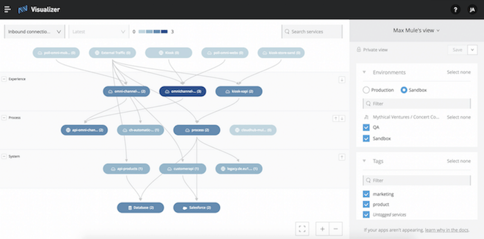
Result 1: Max is able to onboard rapidly to understand the architecture of the system and ensure best practices are being followed.
Resolve production issues faster
Once Max has a high-level understanding of the architecture of the system, he wants his team to be able to tackle the customer complaints about the ticketing process being slow. Their worries are further exacerbated by the fact that a new ad campaign is launching, which they expect will drive even more traffic to the platform.
While Max needed a complete view of his whole application network, his team wants to limit its focus to the services that are related to the website so that they can drill down more quickly. Max is able to adjust the filters in the side panel of the Visualizer canvas, using the tags that his teammates have applied, to narrow the scope to the product side of the organization, thus hiding the marketing services that are unrelated to concert ticketing.
With this most recent Visualizer release, he can now define the architecture for the product side of the organization and save it as a view for his teammates. In this way, he promotes a high-quality source of truth of the architecture for his team and accelerates their path to resolution since they do need to readjust their filters each time they return to Visualizer. They can discover these relevant, architect-defined views in their own dropdown menu, assuming they have access to the applications that the view includes.

Mary Murphy, Senior Developer — CC Website
Mary is a developer on Max’s team. She’s able to open the view that her manager Max defined to see what services could be causing the customers’ complaints about the process for buying tickets being slow.
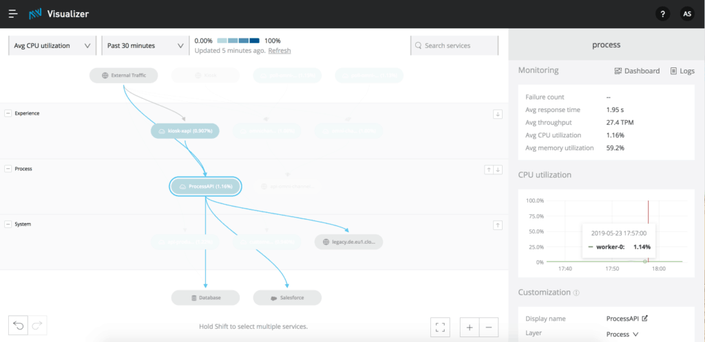
Mary needs to find a way to understand the overall health of the system. Luckily, she’s able to overlay metrics, coming from Anypoint Monitoring, on the topology! She has the option to choose between metrics like Failures, Average Response Time, and Average CPU Utilization. For her particular need, she selects Average Response Time.
She expected to find that the experience API was responding slowly, which she does confirm from the metrics on the nodes, but she could have discovered that from Anypoint Monitoring. What Visualizer allows Mary to do is perform root cause analysis. Since Visualizer highlights the dependencies of this experience API, she can actually trace the problem to a service further down the stack. At this point, she can navigate directly into the Anypoint Monitoring dashboard or logs from the Visualizer panel for the selected, culprit system API. Just like Max, she did not need to dig into the code, app by app, to find the full stack of services. Instead, she finds the root cause of the issue quickly and is able to address it with her team.
Result 2: Mary is able to troubleshoot more quickly and pinpoint the root cause of her issue.
Out-of-the-box performance monitoring
Now that his teammate Mary has used the troubleshooting capabilities in Visualizer to satisfy their customers and keep them from turning to a competitor for booking their concert tickets, Max is ready to expand Concert Connect’s offerings. They are planning to open their website so that concert organizers can directly register their concerts. Max decides to use this opportunity to bring a microservices architecture to the company.
As some of the services will be shared, he wants to perform impact analysis to ensure the existing APIs can withstand the added load. Again, he turns to Visualizer to understand which services can be reused and if he needs to horizontally scale any of them by adding new workers. He checks the metrics like Average CPU utilization and sees how many series are in the time series chart to understand how many workers an application has. He’s able to scale the resources and promote reuse. After his team designs and deploys the new services, he returns to Visualizer to ensure that the way in which the system has been implemented matches the original design.
Result 3: Max was able to use Visualizer to promote reuse of his existing APIs when planning a new project and ensure that they could scale to handle the new load.
Create custom dashboards for reporting
In Visualizer, you are able to export a high-resolution image of your application network and choose if you also want to include the metrics. So, Max exports before and after images of the topology to demonstrate how they decreased average response time, thus addressing customer complaints, and moved to a scalable microservices architecture while leveraging existing services. He puts these images in a deck and uses it in his presentation to the CIO. A picture paints a thousand words and this visual allows him to communicate the noticeable impact he and his team have made in a short amount of time.
Result 4: Max can use images from the Visualizer canvas to communicate the positive impact that his team has made and results they’ve seen in presentations to stakeholders.
With Visualizer, Max was able to quickly understand the dependencies in his system without having to open the properties in Runtime Manager for each file or open the application within Studio, which allowed him to onboard quickly, perform impact analysis, and ensure architectural consistency. Additionally, with the customized view Max created and the metrics coming from Anypoint Monitoring overlaid on the graph, Mary could pinpoint the root cause of an issue quickly and therefore reduce the mean time it took to address customer complaints. At each step, Visualizer accelerated the team’s time to success.
You can get started with Anypoint Visualizer by creating a free Anypoint Platform account. For more information, see our Anypoint Visualizer documentation.