
This blog post explains a recent release of Anypoint Visualizer, which introduced a revamp to host multiple visualizations geared for specific use cases, including a brand new Policy Visualization.
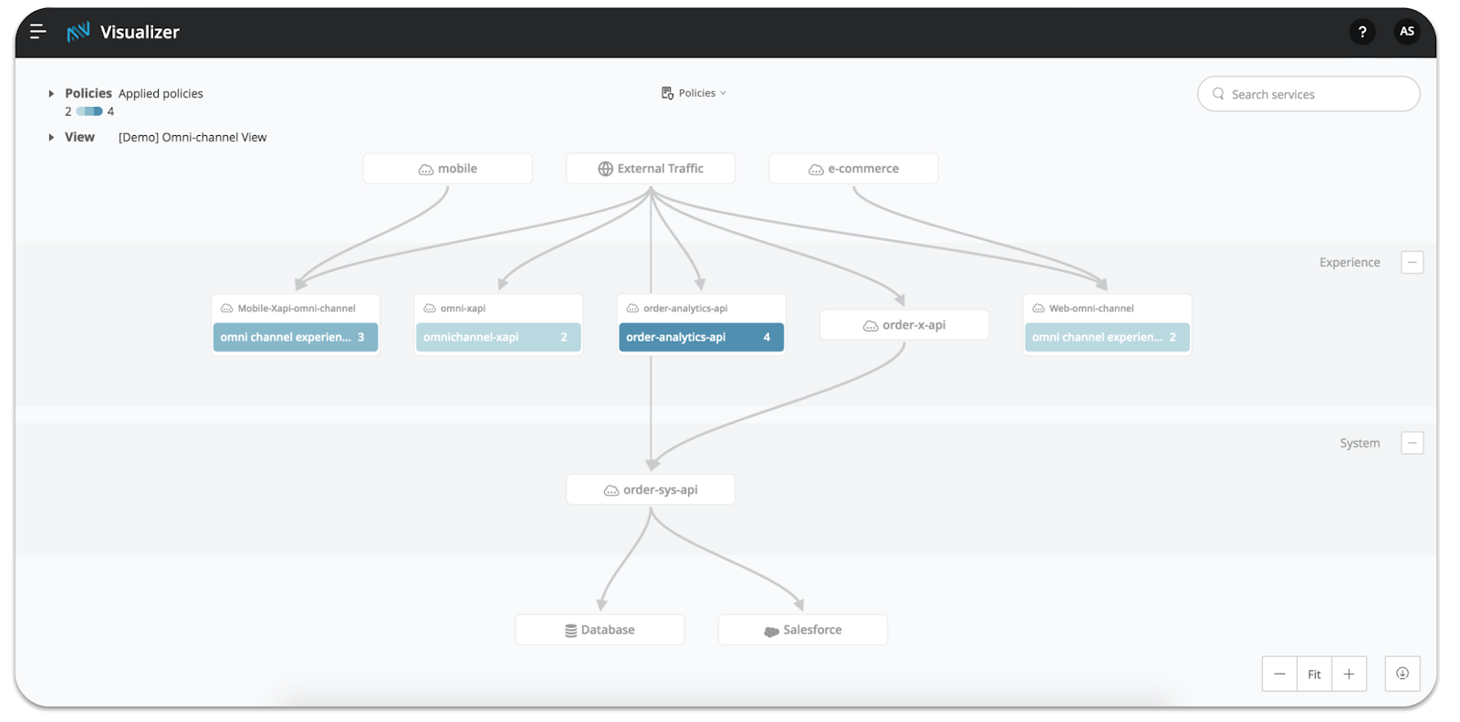
Anypoint Visualizer is uniquely positioned to provide insights into your application network. It is the place in Anypoint Platform where you can learn which APIs, integrations, client apps, and backend systems are connected. Understanding these dependencies has powerful implications — especially when you are able to overlay additional data about these apps onto the network diagram. With runtime details, you can anticipate the downstream implications of restarting an app (architecture). When you add performance metrics, you understand how the response time of one application might affect a dependent service (troubleshooting). Policy details highlight whether you’ve secured an API properly, and what could be implicated by a data breach (policies). The power of Visualizer, and each of these tailored visualizations, is understanding this data in the context of your application network (your services and their dependencies).
I’m excited to announce that Visualizer will now contain three visualizations tailored for architecture, troubleshooting, and policies! You can open your defined views in each of these contexts. Architecture and troubleshooting will look somewhat familiar — they include the same capabilities as before, but have been separated to allow for further differentiation in the future. The new Policy Visualization will be the first place in the platform to see the relationship between Mule App deployments and the APIs they are implementing, as well as which policies have been applied to those APIs.
Introducing the Policy Visualization
We hear from our customers, that they need:
- To ensure their APIs adhere to company security standards before promoting them to production.
- To confirm to InfoSec that the correct policies have been applied.
- To have a quick way to perform monthly or annual security audits and collect the necessary info in one place.
- To quickly modify or add a policy that has not been configured properly.
This Policy Visualization will address these needs by communicating which policies have been applied successfully to your APIs. This visualization helps you to understand your policy strategy in the context of your application network. With it, you can quickly analyze which connected services might be affected as a result of a policy that either has or has not been applied to a particular API.
Let’s use a quick example to bring this to life! Mythical Inc.’s InfoSec team requires that all external-facing APIs have the Client ID enforcement and Rate limiting policies configured. One strategic project, Project Phoenix, has been successfully deployed into pre-prod environments. Ayesha, the lead API Architect, opens the Policy Visualization to confirm that these two policies have been applied correctly before they promote all the APIs to production. All she needs to do is select Client ID enforcement and Rate limiting from the policy list. She immediately sees all but one of the APIs in the experience layer turn green and show 2/2 compliance.
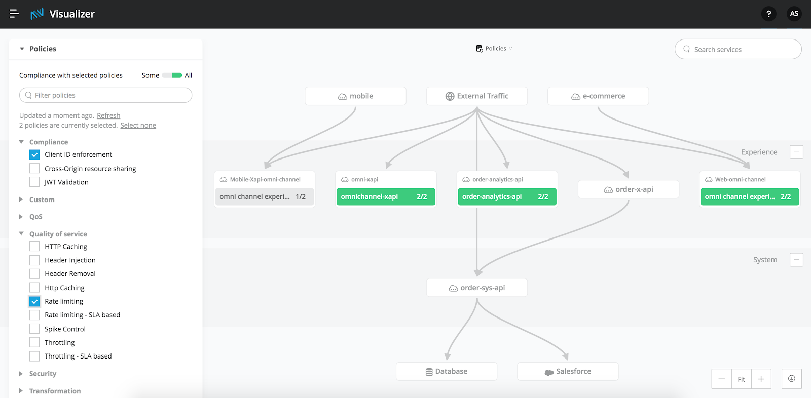
Next, she can click on the one non-compliant API and drill directly into API Manager to apply the missing Rate limiting policy (feature coming shortly after GA). After doing so, she can return to the Policy Visualization, export her view — which now shows that all experience APIs are compliant — and send it to InfoSec to complete the final review process. Once InfoSec is satisfied and approves, Project Phoenix is ready to go!
Excited to try it out? All users with access to API Manager are able to view the Policy Visualization! Check it out! To learn more or ensure you’re using a supported runtime, visit our documentation site.


